


| Distractive Paper | Using Photo Cues | Two Browns | Yellow and Brown | Lime Green and Brown | Brown and Blue on Print |
Choosing Color In Layouts

This is my adorable grandson at the age of 9 months. His mother is feeding him prunes. As you can tell, he does not sit very still since the prunes are all over his precious face.
I want to keep this photo and make a scrapbook page. I will be making this my "Focal Point" in the layout, which means that I want this photo to be where your eye stays when you look at the page. I don't want you straying off and looking at a bunch of other stuff because I don't want you to miss out on this precious dirty face.
Distractive Paper
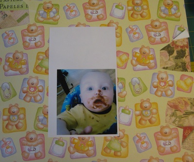
Just because you have some really cute baby paper doesn't necessarily mean you need to use it.
There is too much "BUSY" happening in this example. Where does your eye rest? No where. It is hopping around from one image to another. Your brain tries to lead your eyes to the photo but the distractive images on the paper don't listen so you see everything and, ultimately NOTHING.
Take a look at my grandson's forehead in this photo. It is blue! Take a look at the photo in the section above. His forehead is pink.
With this first paper example you can already see how color affects your photos. Sometimes it is good and other times it is not. Learning to discern the difference between good choices and bad choices take practice. Let me tell you, I've made some really bad choices because I did not know this one important fact.

Using Photo Cues
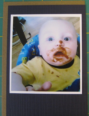
I have chosen a dark blue card stock because of the dark blue on the collar of his shirt, a band down at his belly, and some places on the walker seat. I have chosen to put a brown behind the dark blue to pick up the brown of the prunes smeared on his face.
What happened to the photo? Your eye picks out the dark blue in the areas of his shirt and the brown of the prunes. The dark blue sort of washes out the color of his forehead and eyes. So maybe not a good choice.
This process is what I go through since Color Wheels are torture devices to me. Most books you will read, or YouTube videos you will watch, have the same advice. Color Wheels will help you make a good selection of coordinating colors after you pick your primary color. Using the photo as your color cues is another way to pick coordinating colors. I'm going to tell you what works for me and why in this section.
One other thing to notice is the green color of my grandson's shirt. This is the exact same photo as at the beginning of this section. With the dark blue background paper the color of his shirt has taken on a YELLOW color. The photo has lost all of the fun because of that dark blue background paper.
Two Brown Colors of Card Stock

I switched the paper around from the photo above. The dark brown is in the back and the lighter brown is in the front. What is the difference you see now? The wood floor is more noticeable this time, as is the prune smears. The definition of his cute little head is seen better and the blue of his eyes and the fabric of the walker are more visible. Notice how the body of his shirt has changed color from lime green to a yellow?
Have you also noticed that his skin has a red tinge to it? Looks now like his mother left him out in the sun too long. All just because of the brown colors behind the photo.
The blue colors in the photo have popped out because the neutral color, brown, is a complimentary color for blue. For this photo, not such a good choice.
All of these changes just because of a different color paper is placed behind the photo. Stick with me and you will see a lot of changes happening in the next several photos.
Yellow and Brown Choice

The yellow card stock is vivid, although it is just a yellow color. It takes all of your attention away from the photo. Some people would call this "Loud" since it is really distracting.
If you look at my grandson's picture you can see his shirt is now the place where your eyes go and the wood floor is prominent in the background. His cute little dirty face is not noticed much because your eye is being pulled to the yellow. Do you see how the yellow has also made the color of his face more pink and his head has more definition instead of getting lost? We are sort of on the right track. Still some work to do.
If you have an art background and know about color this process will be totally boring to you. Me, I don't have a clue about color and all the various nuances involved. Did I already mention that Color Wheels are no friend of mine?
After a while of choosing colors in this manner it will get a whole lot easier. I promise!
Lime Green and Brown

Now for some lime green color. There is a bit of it in his walker behind his right shoulder. What do you see happening here? His head is back to being fuzzy. The prune smeared face is prominent here. His shirt, which looked lime green in the first photo has taken on a yellow look. When you look at his eyes you are drawn to the blue of the walker fabric then bounced back to his dirty face. Nothing here to rest your eyes on.
The wood floor is not so prominent as had been in the previous photo. His skin tone is less pink than in the previous photo. This lime green paper seems to wash him out and make him bluish pink as well. I don't think this is a good complimentary color for this photo.
"Is this going somewhere?!" You might be asking yourself this very question right about now. Indeed, this is about to wind up. I have several books on the subject of scrapbook pages. Each book shows a picture of the photo that will be used. The author confidently states the color selection for their photo and how much of each will be used. Frankly, I don't get it. I have to take their word as gospel.
I, personally, am a visual learner. You can tell me stuff but it won't sink in. SHOW me and I'll get it. So, forgive me if you feel that I am wasting your time by all this gibberish.
On to the next one.
Brown and Blue on Print Background
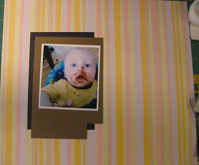
By narrowing down my color options in this manner I have decided that I like the brown card stock behind the photo, the dark blue card stock behind the brown, and a background paper of pastel stripes.
My grandson's precious face is prominent on the page. The background paper helps in steering your eye to the photo and the pastel colors enhance the card stock colors. When you look at the photo, your eyes are brought directly to that adorable face.
Now you go try this on one of your photos. If you don't have scraps, just yet, use the entire sheet of paper and put your photo up in the left top corner with a bit of each paper showing. Your eye will tell you when you land on the right combination of colors. If you find two sets of colors that are good and you can't decide which one you want to use then get a patterned piece of paper and try each one against the patterned paper. That is where you will find your decision made for you.
This is time consuming, I know. It can also be frustrating at first. Once you do this a few times it will get easier and go faster for you. The more you do this technique you will pick out the colors in your photos faster and make your decisions without having to go through this entire "Audition" process all the time.